

#4: Breathing walls | Dances with words | 4’33” (Death metal version)
#4: Breathing walls | Dances with words | 4’33” (Death metal version)
art | science | digital culture | design | creativity | words | tech
Welcome new readers to my newsletter of intersections and uncategorisations. You can read the introduction to find out a bit more about what will be a regular digest of thoughts inspired by my major interests and a subscriber-only set of mailings that reveal more of my personal creative journal and process.
art | tech | design | science
Breathing walls
Buildings have walls, right? But what are those walls? A skin between the inside and outside, perhaps. What if that skin was a living breathing object that gave life to the building? These are ideas explored by Chrisoula Kapelonis in her Masters project at MIT Media Lab in 2018.
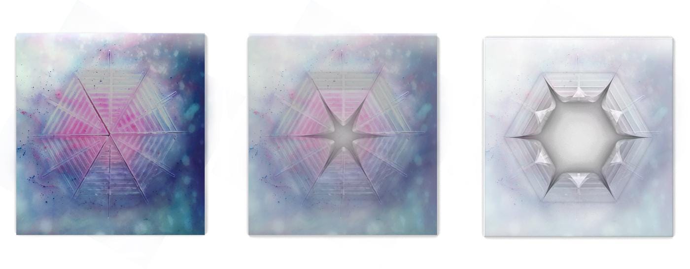
[Panel states, Credit: Chrisoula Kapelonis (CC BY 4.0)]
You can read more about her work at her project site or just watch this video and be mesmerised by the slow movements of this “calm technology”.
words | design | science
Dances with words
I just read something in Robin Rendle’s great typography newsletter. He talked about what he calls WiggleTech that he noticed particularly in the computer game Celeste. (Read his discussion.) It reminds me of Squigglevision, pioneered in cartoons like Dr. Katz, Professional Therapist in which the outlines of the people frantically wiggle about, much in line with the content of the show.
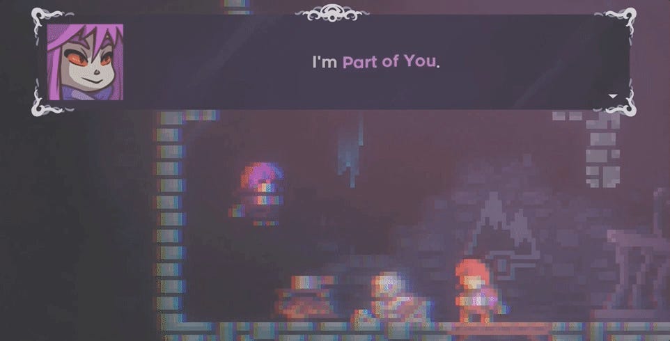
[Screen capture from computer game Celeste showing typography that moves to show emphasis and reflect mood.]
It’s hard to see in the still screenshot of the game above but those purple words “Part of You” undulate for emphasis and effect. Other times the text moves in ways that reflect a mood or urgency. The effect is hard to capture in words so take a look at the video of it he showed.
It made me think of a presentation/performance I gave at the Australian Science Communicators conference that told the story of the dangers of the deficit model of communication in manifesto style. (The deficit model essentially reflects a belief that providing people with more information will persuade them to support your position on an issue. It has been thoroughly debunked. That’s not to say providing more information is bad, but that it’s unpersuasive and potentially anti-persuasive by itself.) You can see the presentation if you click through the link below.

[The cover slide of Against the Deficit Model (2018), my presentation/performance for the Australian Science Communicators conference 2018.]
There are many ways that typography can help communicate. In that presentation I used a somewhat jarring range of sizes and weights of text, positioned in unusual ways. It was something I had first seen in the BLAST Manifesto and I decided to try it out in my own style.
After the conference, Jo Bailey, designer and science communicator I am collaborating with on a project, made a version that layered the pure text version I made with colour and imagery to give it quite a different effect. You can see it at the bottom of my portfolio page for this project.
And then I recently caught up with an old friend Eli Kintisch, who makes excellent science video and written journalism. He talked about my presentation based only on seeing the slides and wondered what it might be like if it were turned into an animated video. I don’t think Eli and I had quite the same things in mind about how it could look because it’s hard to describe a vision when you’re just on different ends of a video conversation on opposite sides of the world. However, it raised a very interesting potential for me and connects with a few ideas I’ve been playing with in typography.
And that is where I come back to the typography in the computer game Celeste. What would happen if my manifesto text used something like “WiggleTech”? How would that change the reception of the content differently to the current layout? Would it obviate the need for a voiceover, such as Eli suggested? Or would it work well in concert with it?
Typography has been around since text but it still reveals new ways of working. I’ve been experimenting with it by employing unusual mediums, such as plant cells, but also have a plan to make a kind of programmable typography that works a bit differently to the forms I’ve seen out in the wild. I always find it curious to see how varied ideas form connections and this gives me incentive to pursue some of these typographic experiments some more with a concrete example in mind.
art | creativity
4’33”
Following up on a topic in last week’s newsletter, here is a death metal band covering John Cage’s 4’33”.
[John Cage - 4' 33'' Death Metal Cover by Dead Territory]
I felt like only the bass player really committed though. [h/t Seth Ellis]
It’s always good to hear from readers so let me know if anything here appealed. You can reach me directly at physicsdavid@gmail.com.